GreenHaus
UX Case Study
Project Overview
-
GreenHaus is a mobile shopping app designed to connect users to small local florists. With the ability to shop digital storefronts and send direct messages to the florist, users get the friendly neighborhood feel right from their phones.
Project Duration: Oct 2021 - Feb 2022
-
Gifting a bouquet of flowers online felt detached and customers had no opportunities to work with a florist online to create a gift for their loved ones.
-
Create a space that welcomed users to connect with small florists and feel the experience of gifting floral arrangements to be as personal for the person gifting as the person receiving.
Role:
UX Designer and UX Researcher
Bring project from conception to completion
Responsibilities include:
User Research
Wire framing
Prototyping
User Testing
User Research
Understanding the User
To make GreenHaus best fit the users, there needed to be thorough research. I created personas, user journey maps, and addressed pain points that users are currently finding in the competition.
User Journey Map
To fully understand the user, we put ourselves in their shoes and sent our persona Mikayla through a user journey map. As Mikayla worked through the tasks, we were able to see how different parts of the journey trigger different feelings. Those feelings were then translated to opportunities to improve the users’ experience as a whole.
Pain Points to Address
-
No customization abilities
Users felt frustrated that the competition was not able to offer customization on floral arrangements. They felt limited and I wanted to make sure they had that option in some form with GreenHaus.
-
Conversations with the Florist
Giving users the ability to message florists directly gave users the chance to make customizations to florals. The florist’s direct interactions makes for a happy compromise where but the florist and the user win.
-
Affordability
Floral arrangements are often offered at a very high price point. By having the florists in charge of their pricing, the pricing is able to remain low and give all the benefits of the right floral arrangement for any given occasion.
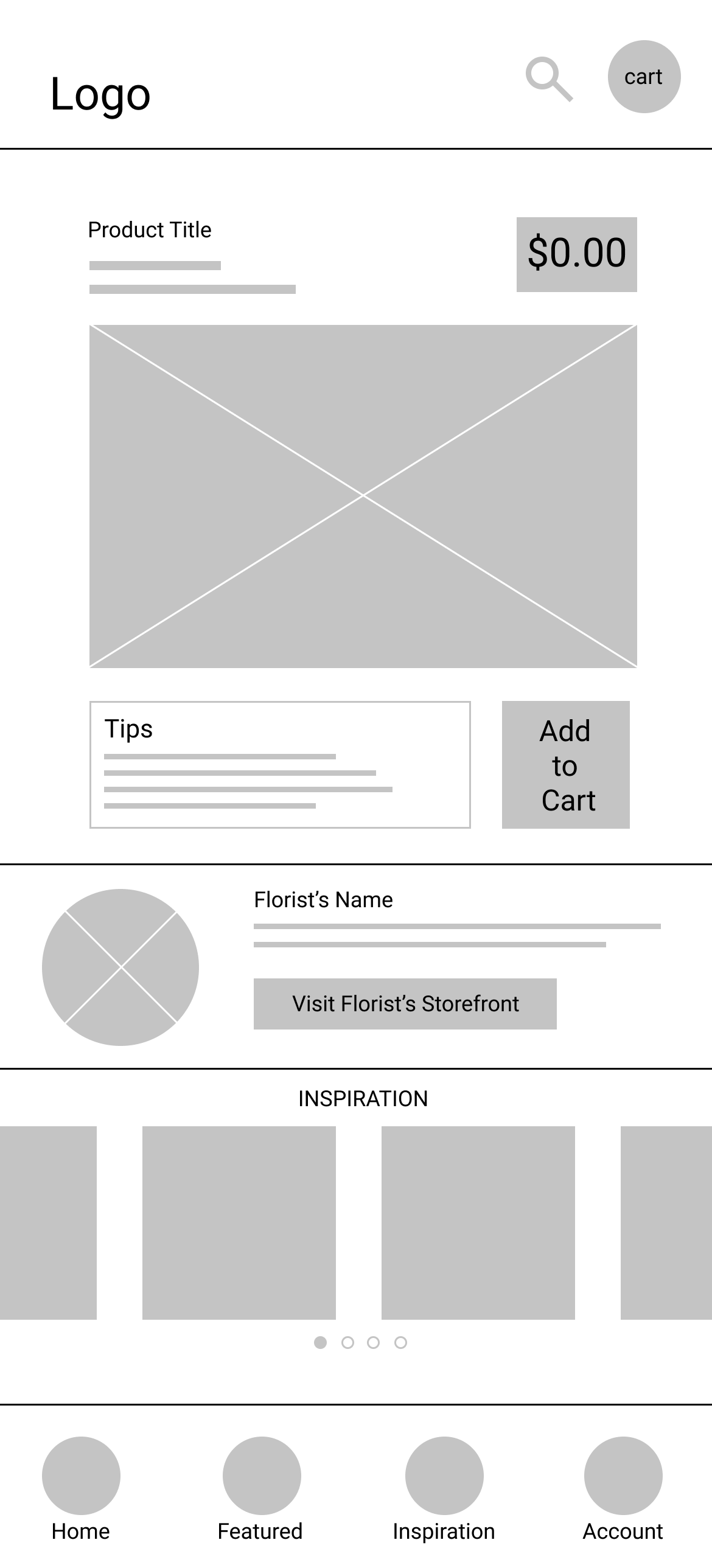
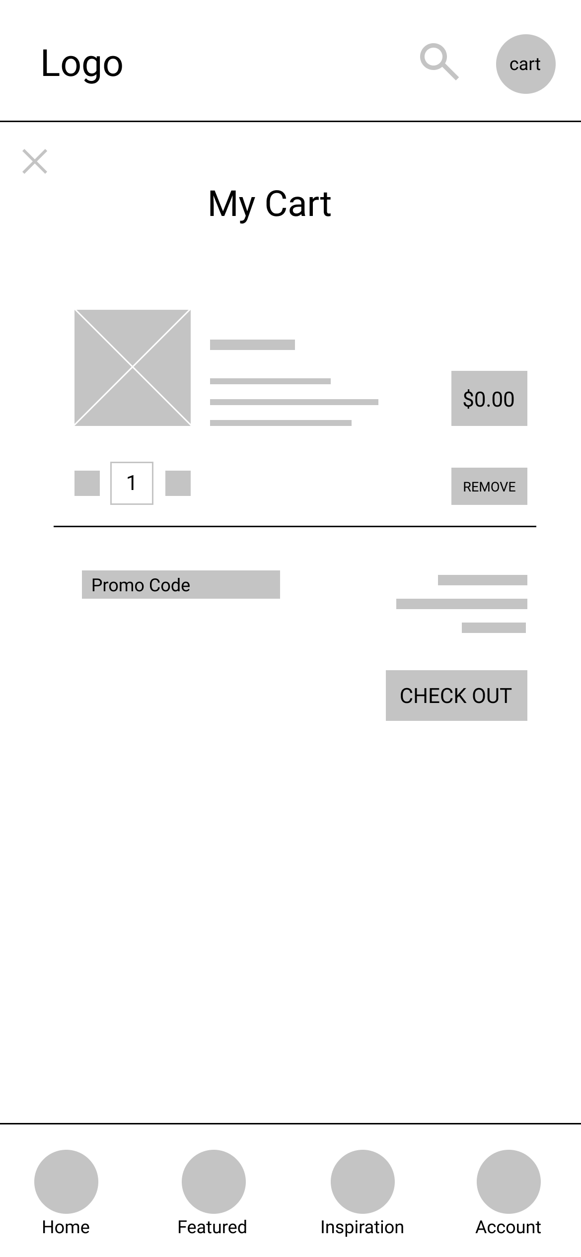
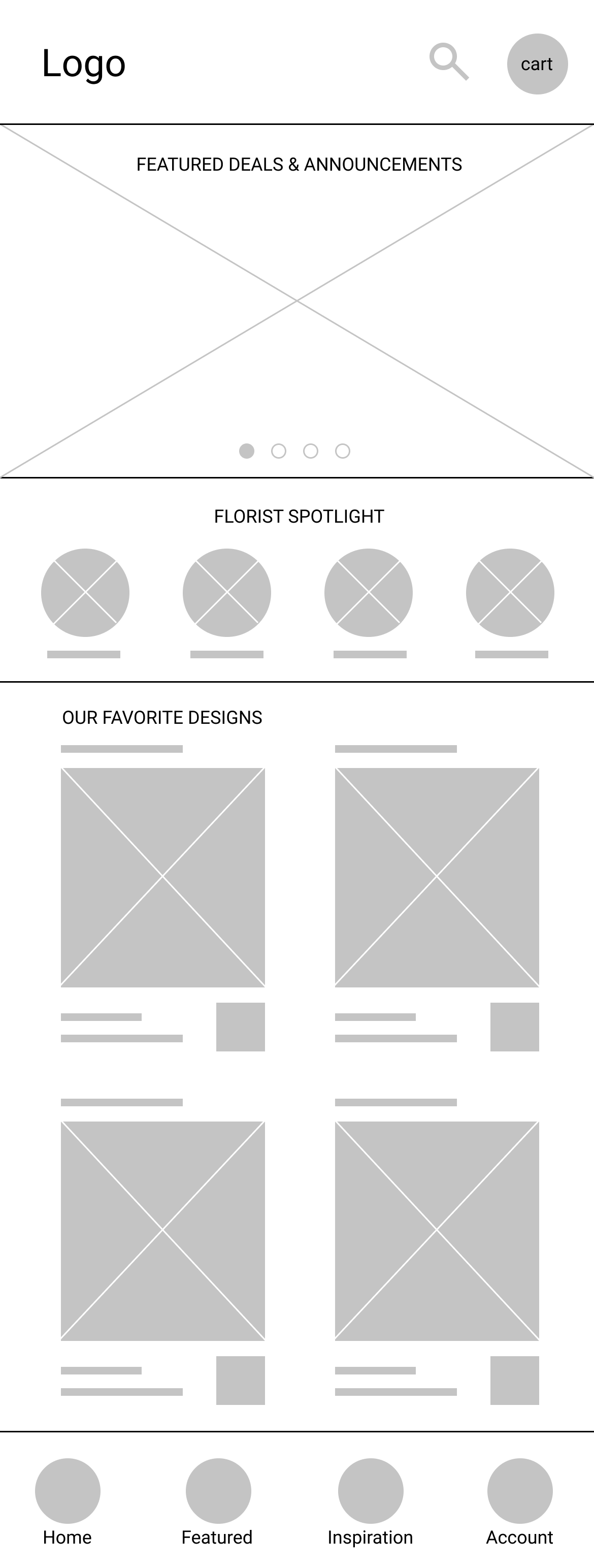
Sketches and Paper Wireframes


Usability Study Findings
Round One focused on testing flows, functionality, and general feedback on the design and the concept.
Found home page too crowded
Users did not need the inspiration feature
There were no ways to adjust cart
Refining the Design
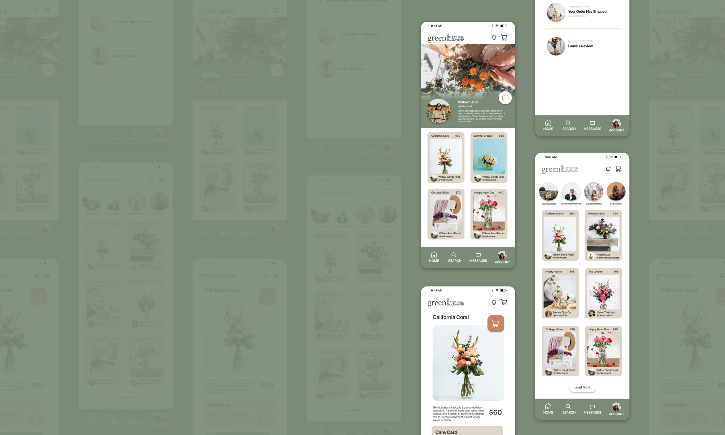
Based on feedback from the usability study, the design was improved by less distracting information, all the items are clearly sectioned, and common shapes helped to create similarity and recognition.
Refined Designs
-

Messaging
Users are frustrated that they are not able to customize the products they are buying from competition. A messaging feature to allow conversations with the florist themselves saves users from the frustration of feeling stuck with the offerings.
-

Florist Storefront
The florist storefront gives users a chance to find and get to know different florists from beyond their area code.
-

Product Page
The product page is sleek and gives additional care instructions to make the florals last. The florist also is highlighted and users are given a chance to connect with them through their storefront.
High-Fidelity Prototype
A high-fidelity prototype was tested and adjusted to make sure all the hotspots are functional and the flows are seamless. Below is a link to the prototype to test yourself in Figma.
